How do we build consistent UI and a clean UI architecture in the age of AI agents, with a strict Screen / Content rule, a design system and previews? The agent (Claude), and the command that lets it see: android preview render
I don’t give Claude Code a UI mockup. I describe the screen in a few sentences. And the screen is ready, and it fits our design system!
$ prompt — create a notifications screen for me. if the user has no notifications yet, show an empty state. it should have a message and an icon.
Claude Code — Build is clean. Now rendering the previews to take a look.
A few minutes later I have a ViewModel, a screen, new components (if they didn’t exist yet) and a preview for every state of that screen and for each component. Before handing the work over, the agent has already turned those previews into images and fixed the problems it saw. And we can review it without even opening Android Studio.
Most of the pieces aren’t new: stateless composables, previews and a design system.
The problem: “it compiles” is not the same as “it looks right”
An agent can call the job done once the Compose code compiles. But is it really done? How closely did it follow your design system? The agent may invent its own buttons. It may drift away from your main colors.
The way to catch this is to open Android Studio, start the emulator and test the app by hand. But that is slow, and it doesn’t match the speed we expect from AI. The agent can’t do this without a device either. It can start an emulator, take screenshots with adb and check them, but again, the problem is speed.
So I wanted every screen to be checkable by both me and the agent without running the app, and every screen to be built from the same small set of pieces.
Four things got me here:
- The Screen / Content split
- What we check previews against: the design system
- How the agent checks previews:
android preview render(with the Android CLI) - The rules the agent has to follow:
CLAUDE.md
The Screen / Content split
The Screen defines the overall structure of the screen. It knows the ViewModel, collects the state and forwards events. The Content lives inside it.
@Composable
fun NotificationsScreen(
    onBack: () -> Unit,
    onNotificationClick: (NotificationUiModel) -> Unit,
    viewModel: NotificationsViewModel = hiltViewModel()
) {
    val uiState by viewModel.uiState.collectAsStateWithLifecycle()

    NotificationsContent(
        uiState = uiState,
        onBack = onBack,
        onNotificationClick = { notification ->
            viewModel.markAsRead(notification.id)
            onNotificationClick(notification)
        },
        onMarkAllAsRead = viewModel::markAllAsRead
    )
}
The Content, on the other hand, is a stateless composable. It only takes a plain UI state. That makes it easy to look at its different states in previews:
@Composable
fun NotificationsContent(
    uiState: NotificationsUiState,
    onBack: () -> Unit,
    onNotificationClick: (NotificationUiModel) -> Unit,
    onMarkAllAsRead: () -> Unit,
    modifier: Modifier = Modifier,
) {
    Column(modifier = modifier.fillMaxSize()) {
        AppToolbar(
            title = stringResource(R.string.notifications_title),
            navigationIcon = {
                AppIconButton(
                    onClick = onBack,
                    contentDescription = stringResource(R.string.content_desc_back),
                    // ... shortened for this post.
In a way, we’re also applying state hoisting here. What it gives previews: we can see every state the screen can end up in.
@Composable
private fun NotificationsPreview(uiState: NotificationsUiState) {
    MyCustomTheme {
        NotificationsContent(
            uiState = uiState,
            onBack = {},
            onNotificationClick = {},
            onMarkAllAsRead = {}
        )
    }
}

@Preview(name = "Notifications · loaded", heightDp = 900)
@Composable
private fun NotificationsLoadedPreview() {
    NotificationsPreview(NotificationsUiState(notifications = NotificationsSampleData.notifications()))
}

@Preview(name = "Notifications · empty", heightDp = 640)
@Composable
private fun NotificationsEmptyPreview() {
    NotificationsPreview(NotificationsUiState())
}
There is a second, stricter reason for this split. The preview renderer can’t render the preview of a composable that calls hiltViewModel(). For example, if we call NotificationsScreen instead of NotificationsContent, we get an error like this:
Error rendering NotificationsLoadedPreview: Expected an activity context for creating a HiltViewModelFactory but instead found: com.android.layoutlib.bridge.android.BridgeContext@6e0b5316
java.lang.IllegalStateException: Expected an activity context for creating a HiltViewModelFactory but instead found: com.android.layoutlib.bridge.android.BridgeContext@6e0b5316 at
...
One preview per state
The rule we give the agent shouldn’t be “add a preview” but “add a preview for every state the screen can be in”. Over time this pushes both us and the agent to design the states the screen can end up in. For me, that turned out to be a good side effect. It means seeing those states before production, and catching them while writing the previews!
- Loading state
- Empty state
- Error state (response errors, retry states)
- Success state (the data is loaded)
Design system: what do we check previews against?
A preview answers “what does it look like?”. But how do we verify it? The answer: the design system.
Tokens, core components, app colors, typography…
- Colors and typography should be read through theme tokens.
- Core components built on those tokens: primary/secondary buttons, cards, icon buttons, bottom sheets, chips…
The rule that turns the design system into a reference: Never use raw values in feature code. This rule forces the agent to use the design system.
On top of that, the agent gets the most out of the design system both while building and while verifying.
Teaching the agent to see: android preview render
I used to be the one looking at the previews. The agent didn’t see them. It handed work over without seeing it, signing off with “build successful”. But how correct was the result? I’d open Android Studio, render the preview and check it myself. If something was misaligned or missing, I’d point it out and ask for a fix. That was a slow loop. Now the agent runs the android preview render command from the Android CLI, gets the preview as a PNG and adds it to its check loop. If something is broken, it keeps going until it’s fixed. In the end we get more accurate results and fewer mistakes.
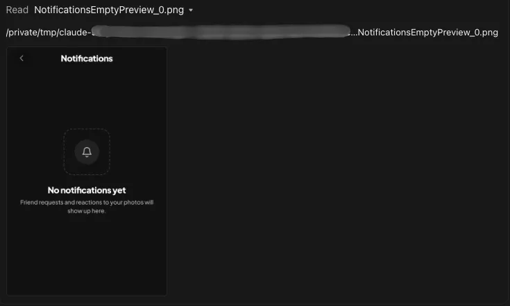
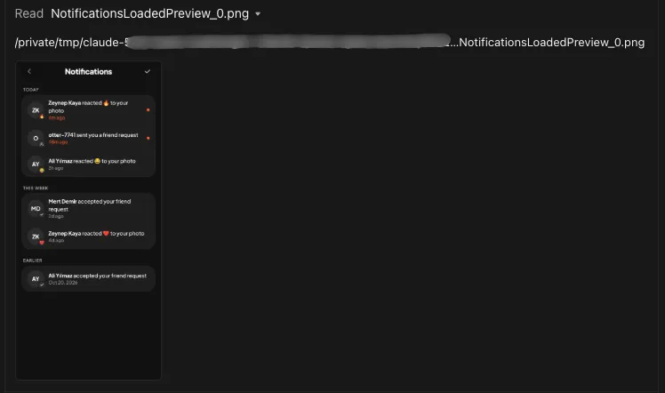
So what is android preview? There are two commands:
android preview list: Lists the preview composables in the project.
com.example.notifications.NotificationsScreenKt.NotificationsEmptyPreview
com.example.notifications.NotificationsScreenKt.NotificationsLoadedPreview
android preview render: Renders a preview composable function and outputs a PNG.
- To render a specific preview:
android preview render --fqn=com.example.notifications.NotificationsScreenKt.NotificationsLoadedPreview - If your app has product flavors, you’ll need to specify the variant:
android preview render :app@devDebug
Guiding the agent: CLAUDE.md
To guide the agent so it can build with as few mistakes as possible, we need to set up CLAUDE.md, our rules file. The agent reads it in every session, so it knows about the app architecture, the design system and the preview setup, and follows the rules in this file.
An example CLAUDE.md file:
## Design System

Dark-only UI built from three core colors (background, primary orange, white text)
plus neutral steps between them. Tokens live in `ui/theme/`, reusable components
in `core/ui/composable/`.

**Golden rules** (apply to every new or edited screen/component):
- Read every design value from `MyCustomTheme.colors / typography / shapes / spacing`.
- Never write raw `Color(0x…)`, `RoundedCornerShape(…)`, `fontSize` / `fontWeight`
  literals in feature or component code. If a needed value is missing, add a token first.
- Use `MyCustomTheme.spacing.*` for padding and gaps when the value is on the scale.
  Off-scale values stay as plain `dp` and are not added to the scale.
- Prefer an existing component over building a new one. A new reusable piece goes in
  `core/ui/composable/<group>/` with a `@Preview`, and is added to the gallery.

**Colors**
| Group    | Tokens                                              |
|----------|-----------------------------------------------------|
| Surfaces | background, surfaceLow, surface, card, surfaceHigh  |
| Primary  | primary, onPrimary, primaryContainer, ...           |
| Text     | onSurface, onSurfaceVariant, textMuted              |

Usage: depth comes from surface steps plus a 1dp outline, never drop shadows.
Orange marks the single next action and the current selection; avoid two competing
orange buttons on one screen. White on primary is only 3.2:1 contrast, so labels on
orange fills are 17sp bold or larger.

**Components**
| Component                         | Use for                                           |
|-----------------------------------|---------------------------------------------------|
| PrimaryButton, SecondaryButton    | Full-width actions (one primary per screen)       |
| AppIconButton + style             | Round icon buttons; Glass style over photos       |
| ListCard, ListDivider, MenuRow    | Grouped rows in one card (settings, lists)        |
| LoadErrorState                    | A screen whose *first* load failed; later refresh |
|                                   | failures use the info bar instead                 |
And the part that turns previews into a verification step:
**Previewing**: every screen is a thin `XScreen` (ViewModel, state collection) plus a
stateless `XContent` (UI state + lambdas) with one preview per state (loading, empty,
first-load error, loaded).

**Check UI work yourself, without a device**: after adding or changing a screen,
component or preview, render the affected previews and look at every PNG before
handing the work over:
`android preview render :app --component-tree -o <scratch dir> --fqn=<Preview FQN>`

The renderer is layoutlib: no DI, network or device APIs, so previews
must target `XContent`, never a composable that calls `hiltViewModel()`, and a preview
may be at most 3000dp tall.
A few things I learned while writing this file:
- Writing the rule isn’t enough; write the reason too. When the agent understands both the rule and why it exists, it makes the right call in similar cases even where there is no rule.
- Write down the edge cases we’ve argued about. “First load fails → full-screen error state; refresh fails → info bar” is a single line in the file. Before that line existed, I had to repeat it for every new screen.
- Keep the file up to date. When a new component and preview are added,
CLAUDE.mdshould be updated too, so the agent doesn’t forget the new pieces in later sessions. - Keep it short enough to read. The agent reads this file into its context in every session. Every line has a cost.
The end-to-end loop
Put together, building a screen looks like this:
- I describe the screen and its features to the agent: what the user can do and which states it has.
- The agent (Claude) reads
CLAUDE.md, checks the components and tokens, and starts building the screen. - Preview composable functions are created for each state of the screen.
- The agent (Claude) runs
android preview renderand checks the rendered previews against the design system. - Only after the agent hands the work over do I start reviewing. I look at the previews, then run the app on a device and test it.
Limits
Previews are not a device. There are things they can’t catch:
- Real data from a service or a database
- Navigation, the back stack, configuration changes, process death
- Hardware features (camera, sensors, etc.)
- Widgets
For these, we still need to run the app and test it on an emulator or a real device.
Takeaways
- Split every screen into a thin Screen and a stateless Content. That’s what makes every state visible in a preview, and it’s the only piece a preview renderer can draw.
- Ask for one preview per state, not one per screen. It forces the states to be designed.
- Give the agent a closed vocabulary: tokens and components, no raw values. Consistency comes from constraints, not from asking nicely.
- Let the agent render its own previews with
android preview render, and tell it to look at both the image and the component tree before handing work over. - Write rules together with their reasons, record the decisions you’d otherwise repeat in every review, and keep the file as short as you can.
The agent writes the code and checks the pixels. What it should look like, we agree on in the previews.